'body of the message'
Ortsbegehung No. 4
NBK Berlin 1998
curated by Inke Arns
Thilo Wermke about
Daniel Pflumm
Art in the traditional sense is nowhere to be found in Daniel Pflumms body of work. Shown in a non-art context, most viewers would assume it to be the presentation of a polished corporate strategy with strong merchandising component. There is, in fact, a firm owned and represented by Pflumm, and with and within it he creates and fashions his works of art. With faint echoes of Mies van der Rohes adage less is more, the ascetic purism of the image transported by the company-specific graphics, typography, illuminated advertising, videotapes and installations possesses a style guaranteeing a high recognition factor. The next question is: what does Pflumms firm produce, what products are his ad strategies marketing? This is where matters get complicated. It is the point where art begins, and if this were not the case, Pflumm could well be trading his worth on the stock exchange at this very moment.
Pflumms operation goes by
a number of different names. Elektro is one,  Panasonic
another and a new one is bound to be in the pipeline. What is paradoxical
about his firm is that it doesnt produce articles, but merely presents
itself via logos and symbols. It has to do with the fascination contemporary
advertising and product marketing exudes, and against which Pflumm is no
more immune than anyone else. Admittedly, many advertising clips offer
more than a modern-art exhibition; its a problem the art world recognizes,
but it has yet to come up with answers. The options point in two radically
different directions: one including, and one excluding, the new technologies.
Artists have struck out on either path. The first option is possibly the
more difficult, especially since it exposes the artist to the avant-garde
paradigms of progress that write Caution: limited tenure all over the
new technologies.
Panasonic
another and a new one is bound to be in the pipeline. What is paradoxical
about his firm is that it doesnt produce articles, but merely presents
itself via logos and symbols. It has to do with the fascination contemporary
advertising and product marketing exudes, and against which Pflumm is no
more immune than anyone else. Admittedly, many advertising clips offer
more than a modern-art exhibition; its a problem the art world recognizes,
but it has yet to come up with answers. The options point in two radically
different directions: one including, and one excluding, the new technologies.
Artists have struck out on either path. The first option is possibly the
more difficult, especially since it exposes the artist to the avant-garde
paradigms of progress that write Caution: limited tenure all over the
new technologies.
Daniel Pflumm chose the first
route, and is negotiating it surefootedly. Technology is his means to an
end, the computer a tool used to formulate questions. One inevitably wonders
to what degree critical insight can be conveyed by art radiating instantaneous
elegance in its cold abstraction. To be sure, Pflumms works do not 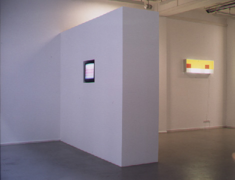 articulate
criticism along the lines of a denouncement of the multis and the media
for the edification of the public. Rather, his commentary is hidden beneath
a subversion which is over-affirmative, unable to wholly conceal its fascination
with its object. Pflumms works consciously link up with the corporate
strategies (and certainly have no intention of being measured against anything
less than the major players) that condition our visual behaviour in the
age of globalization. This is the cue for the uniform appearance of Daniel
Pflumms products, which captivate the viewer by a pre-existent corporate
identity. While promotional T-shirts, LPs, or fluorescent display cases
with changing colour combinations made their mark, it was the video presentations
that made his name. In these installations, the monitor is invariably recessed
into the wall so that a flush, integrated picture area can present unadulterated
video images, with all intrusive technology out of sight.
articulate
criticism along the lines of a denouncement of the multis and the media
for the edification of the public. Rather, his commentary is hidden beneath
a subversion which is over-affirmative, unable to wholly conceal its fascination
with its object. Pflumms works consciously link up with the corporate
strategies (and certainly have no intention of being measured against anything
less than the major players) that condition our visual behaviour in the
age of globalization. This is the cue for the uniform appearance of Daniel
Pflumms products, which captivate the viewer by a pre-existent corporate
identity. While promotional T-shirts, LPs, or fluorescent display cases
with changing colour combinations made their mark, it was the video presentations
that made his name. In these installations, the monitor is invariably recessed
into the wall so that a flush, integrated picture area can present unadulterated
video images, with all intrusive technology out of sight.
Daniel Pflumm has created
computer animations that are video loops delimited by varying intervals
of repetition. The familiar perceptive pattern is however disrupted by
a repetition frequency deviating from that of conventional animation. Predominant
in the loops are familiar corporate logos we see daily, be this in print
or electronic media, or plastered on billboards round the city as mirrors
of various corporate strategies. Pflumm re-constructs these logos on his
computer, breaks 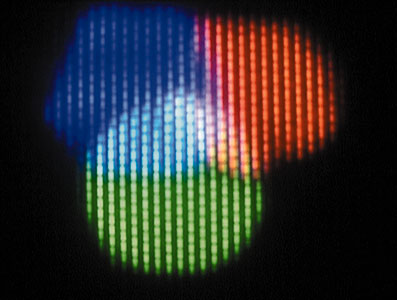 them
down into their elements of structure and colour. From these elements he
composes sections of his loops; in one animation, for instance, we witness
the way particles are joined up to form the signet of the US communications
giant AT&T. The monotony of this sequence of images reveals
the symbolic character of visual forms apparently taped only by coincidence.
Another loop confronts the viewer with a sequence of logos flying past
as fast as he can make them. This maximum acceleration, so intrinsic to
the modern age, is exaggerated to a degree which strains even eyes schooled
by the fast-changing images of our MTV era. Who knows: such a sequence
might be a foretaste of media standards in the future, of everyday TV in
one hundred years time it has been proved, after all, that human evolution
adapts itself to technical advances.
them
down into their elements of structure and colour. From these elements he
composes sections of his loops; in one animation, for instance, we witness
the way particles are joined up to form the signet of the US communications
giant AT&T. The monotony of this sequence of images reveals
the symbolic character of visual forms apparently taped only by coincidence.
Another loop confronts the viewer with a sequence of logos flying past
as fast as he can make them. This maximum acceleration, so intrinsic to
the modern age, is exaggerated to a degree which strains even eyes schooled
by the fast-changing images of our MTV era. Who knows: such a sequence
might be a foretaste of media standards in the future, of everyday TV in
one hundred years time it has been proved, after all, that human evolution
adapts itself to technical advances.
Pflumm is not striving to make judgements with his videotapes; he asks questions instead. His works are accomplished intuitively, he says. Pflumm is interested in the (possibly fake) glossy veneer of shapes and colours. The intensive scrutiny of occasionally very monotonous image sequences places in question the viewers perception. The human craving for visual fodder is wholly satisfied by the aesthetics of modern advertising; this is perhaps one reason why art is undergoing a sustained loss of significance. In contrast to the sporting ambition which can be observed unfortunately often in artists working in the new media, however, Pflumms concern is not to coax superlative performances from his material. The claim staked by Pflumm is relatively narrow in definition, and he sticks to this territory, which is defined for example by the adherence to clear forms and pure colours. It is his way of rejecting artistic fantasies of omnipotence. His work is not merely reactive, however: he develops his personal logos on the basis of his own partly fictional, partly real, enterprises. The real ones, like the television broadcaster Hallo TV which he helps to run, the Elektro music label specializing in advanced electronic music, or the Panasonic club, all represent forms of practice specific to Pflumm, who incorporates their logos into his videotapes in appropriate form.
- Translated by Tom
Morrison -